Claim Submission Wait Screen Redesign

Improving clarity and reducing perceived wait time during long claim‑upload processing

1 minute read

The claim‑submission flow occasionally required significantly long processing times, with the potential to reach up to 90 seconds in certain cases. The original experience relied on a looping spinner and vague text, which led many users to believe the system had stalled. The design challenge centered on reducing confusion and perceived wait time without altering backend processing.


Guided by Nielsen Norman Group’s response‑time principles, the team identified that delays longer than 10 seconds demand continuous feedback, clear expectations, and reassurance. Research confirmed this need: nearly half of participants considered exiting the flow early, and many requested progress indicators, time estimates, or clearer explanations of what was happening.


A Safe → Medium → Spicy exploration framework generated a wide range of concepts—from simple loaders to dynamic animations and distraction‑based ideas. Iterative reviews with PMs and engineering helped narrow the direction to solutions that balanced feasibility with clarity.


Technical constraints shaped the early design approach. Because the frontend initially couldn’t communicate with the backend, progress had to be simulated through animation. Later, engineering enabled a true progress bar, allowing for accurate real‑time feedback.


The final solution included four key elements:


  • A dynamic animation signaling active processing

  • Human‑friendly, descriptive copy explaining backend steps

  • A clear time estimate (“May take up to 40 seconds. Do not exit the page.”)

  • A backend‑connected progress bar providing real‑time progress


Three rounds of usability testing validated the improvements. Users felt more confident staying in the flow, better understood the reason for the wait, and no longer assumed the system was stuck. The project also served as the first real‑world implementation of the new design‑system progress bar, establishing a scalable pattern for future long‑load experiences

SCROLL DOWN FOR A FULL DEEP-DIVE

Improving clarity and reducing perceived wait time during long
claim‑upload processing

1 minute read

The claim‑submission flow occasionally required significantly long processing times, with the potential to reach up to 90 seconds in certain cases. The original experience relied on a looping spinner and vague text, which led many users to believe the system had stalled. The design challenge centered on reducing confusion and perceived wait time without altering backend processing.


Guided by Nielsen Norman Group’s response‑time principles, the team identified that delays longer than 10 seconds demand continuous feedback, clear expectations, and reassurance. Research confirmed this need: nearly half of participants considered exiting the flow early, and many requested progress indicators, time estimates, or clearer explanations of what was happening.


A Safe → Medium → Spicy exploration framework generated a wide range of concepts—from simple loaders to dynamic animations and distraction‑based ideas. Iterative reviews with PMs and engineering helped narrow the direction to solutions that balanced feasibility with clarity.


Technical constraints shaped the early design approach. Because the frontend initially couldn’t communicate with the backend, progress had to be simulated through animation. Later, engineering enabled a true progress bar, allowing for accurate real‑time feedback.


The final solution included four key elements:

  • A dynamic animation signaling active processing

  • Human‑friendly, descriptive copy explaining backend steps

  • A clear time estimate (“May take up to 40 seconds. Do not exit the page.”)

  • A backend‑connected progress bar providing real‑time progress


Three rounds of usability testing validated the improvements. Users felt more confident staying in the flow, better understood the reason for the wait, and no longer assumed the system was stuck. The project also served as the first real‑world implementation of the new design‑system progress bar, establishing a scalable pattern for future long‑load experiences

SCROLL DOWN FOR A FULL DEEP-DIVE

Role: Product Designer (Animation + UX)

Team: Product Designer, Content Strategy, Research, Product Manager, Engineering

Platform: Web & Mobile Responsive

Challenge / Brief

Wait screen loading times had the potential to take up to 90 seconds when a user uploaded a medical claim. Although this wasn’t ideal and the design team recommended reducing the loading time, a near‑term backend change wasn’t possible. A UX solution was needed to prevent confusion, reduce perceived wait time, and keep users from exiting the flow prematurely.

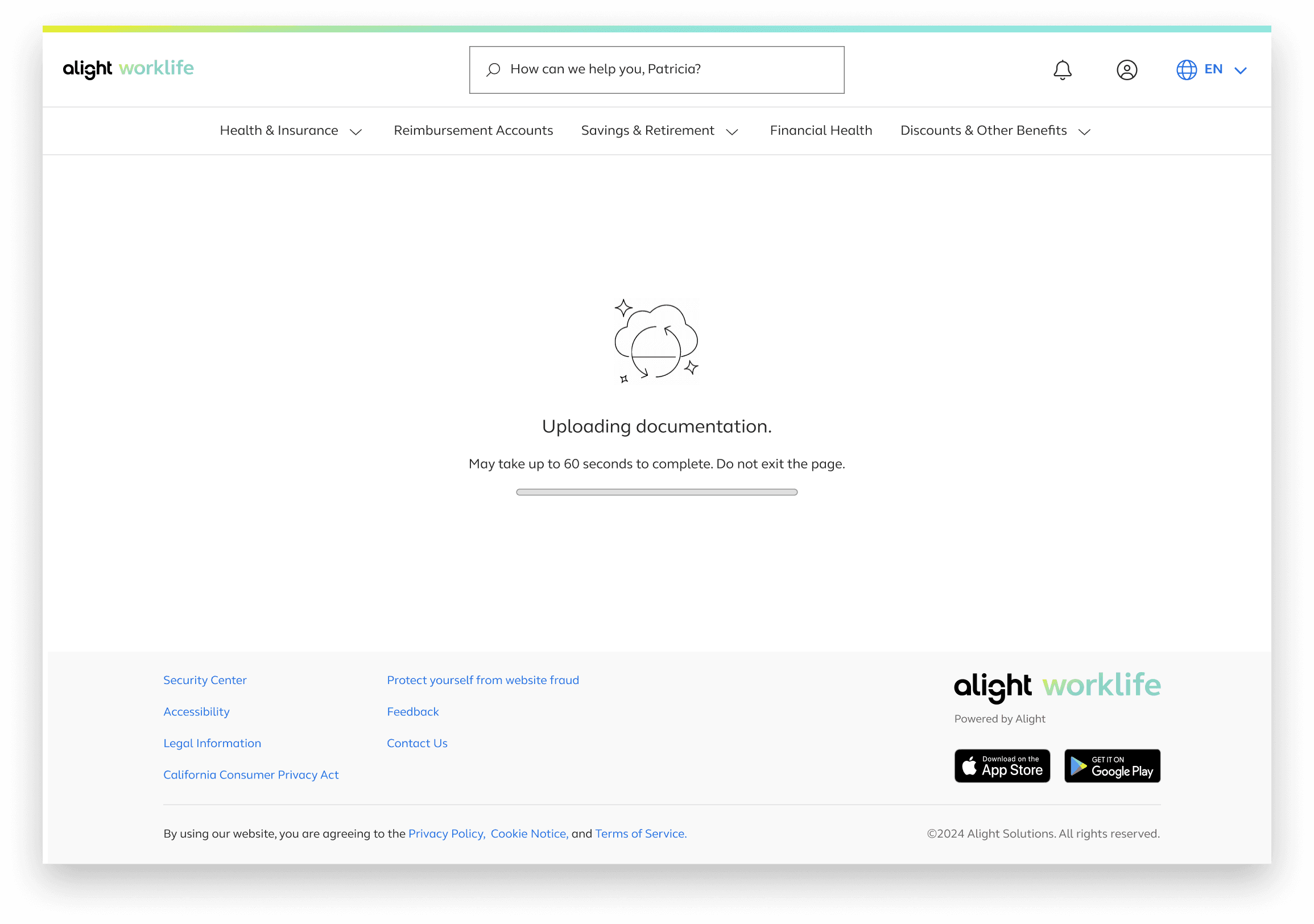
What existed previously: Looping circle loading animation. Basic, undescriptive text: Uploading documentation. Scanning documentation. Done!

Research & Data Leveraged

Nielsen Norman Group Timing Guidelines - 0.1 second: Instantaneous response. 1.0 second: User feels system is reacting instantly, but a lag is noticeable. 10 seconds: Keeps user’s attention, but anything beyond risks losing attention. Myers (1985): Showing a percent‑done indicator improves engagement for long waits.

Interpretation & Impact:

- Potential 90‑second load could appear broken.
- Showing uploaded documentation for only 10 seconds could mislead users.
- Continuous feedback required.
- Users need reassurance, time expectations, and progress visibility.

Explorations
Since this would be a new design I explored various ideas ranging from safe to outside of the box

Safe:
Realistic, expected, feasible ideas. Using existing mobile loader, Product Manager ‑suggested dot loader, straightforward copy updates.

A design being utlized for the mobile app

A design suggestion given by the product manager of loading dots that are accompanied by dynamic text

Medium:
Passive animations. Progress‑linked animation. Light reading or fun facts.

in alights style
Discords loading feature
fun facts about medical coverage

an old exploration from another project that influenced this more dynamic design

Discord's loading displays a loop animation as well as hot key tips that change over time

Spicy:
Games. Trivia. Distraction‑based concepts. Note: We held weekly syncs with PMs to share ideas and update iterations.

Iteration Timeline

V1 – Broad Exploration

  • Safe/Medium/Spicy concepts

  • Introduced dynamic animation

  • Highlighted need for clearer copy


V2 – Narrowing Direction

Two animated prototypes:

  • Option 1: Dynamic animation + step‑based copy

  • Option 2: Dot animation + two layers of copy


V3 – Technical Constraints/finalizing designs for testing

  • No backend communication with the front end for realtime progress tracking

  • Still needed to simulate progress

    • GIFs were possible but required there was a px size limitation.

  • Average upload time reduced from 60s → 40s

  • Moved forward with the dynamic animation & step based copy

This was our first iteration of the dynamic copy along with timing suggestions based on the orginal 90 second edge case

This was our first iteration of the dynamic copy along with timing suggestions based on the orginal 90 second edge case

Note

Although this design was well received, it was later brought to our attention that an animation could only be added if it was formatted into a gif. Switching the file from a mp4 to a gif was too small this the limitations of software on the page so a previously made loading GIF under the mobile app was used with more detailed copy.

Validation & Testing

Round 1 – Indefinite Loading Copy:
Uploading Claim (60 seconds)

Uploading Documentation
- Scanning Document
- Upload Complete

Reviewing Claim (20 seconds),
- Reviewing expense eligibility,

Submitting Claim (6 seconds).
- Submitting Claim

Most participants said they would leave after the inital Upload wait screen due to believing something is wrong or broken

“Maybe a little note saying this could take up to 3 minutes.”

“I would feel more assured if I saw the progress bar gradually filling.”

Round 2 – Added Time Estimates

Added lines such as: “May take up to 60 seconds. Do not exit the page.”


Did not significantly reduce early‑exit behavior.

  • Needed more detailed, human‑friendly explanations.

Round 3 – Detailed Dynamic Copy + True Progress Bar

By this time engineering enabled backend‑connected progress. Collaborating with product managers on a more detail explanation on what happens in the backend as well as enlisting the use of CoPilot to refine copy


  • Users felt more confident staying in the flow.

  • Progress bar + detailed copy significantly reduced uncertainty.

  • Testing validated the new design system progress bar for future teams.


After these research outcome design and product managers worked on a more detailed explanation on what happens in the backend as well as enlisting the use of CoPilot to refine copy


Final Design

1. Dynamic Animation

Adds visual interest and reassures users the system is working.


2. Descriptive Dynamic Copy

Explains what’s happening without technical jargon.


UploadingClaim


  • “Getting your documents ready for review”

  • “Verifying document quality to ensure a smooth review ahead”

  • “Extracting key information and confirming your claim type”

  • “Matching your claim to applicable plan rules and policies”


Submitting Claim


3. Static Time Estimate

Sets expectations:

“May take up to 40 seconds. Do not exit the page.”


4. Progress Bar

Backend‑connected progress bar gives real‑time feedback.

Outcome / Reflection

Introducing the redesigned wait experience not only improved user trust during long processing times but also set a new standard for how the product handles extended system operations. The project served as the first opportunity to test and refine the design‑system progress bar in a live environment, ultimately strengthening the component for future teams. The iterative testing cycles highlighted how meaningful improvements emerge when research, engineering constraints, and user expectations are continuously re‑evaluated. This work underscored the importance of transparency in moments of friction and demonstrated how thoughtful UX can turn unavoidable delays into guided, reassuring experiences.