
AI Claim Submission
From Days to Hours: Modernizing Claim Eligibility with AI
1 minute read
As the Lead Product Designer, I partnered with product, engineering, and content teams to redesign Alight’s claim submission experience across mobile and web. The existing process was a slow, five‑step, manually adjudicated workflow that created delays, high call volume, and participant frustration.
Challenge
Users uploaded receipts online, but every claim still required human review. Decisions took days, and unclear language around eligibility vs. reimbursement caused confusion and unnecessary support calls. Our goal was to introduce an AI‑driven eligibility check using IDP and Generative AI to deliver near‑real‑time feedback.
Approach
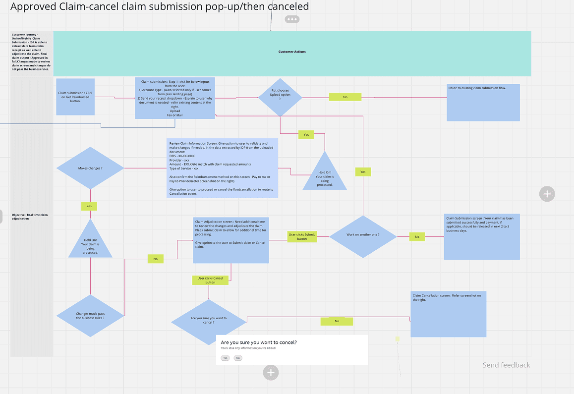
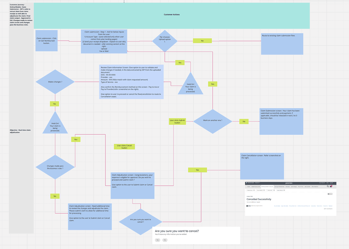
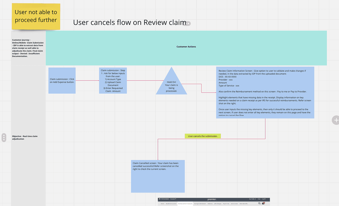
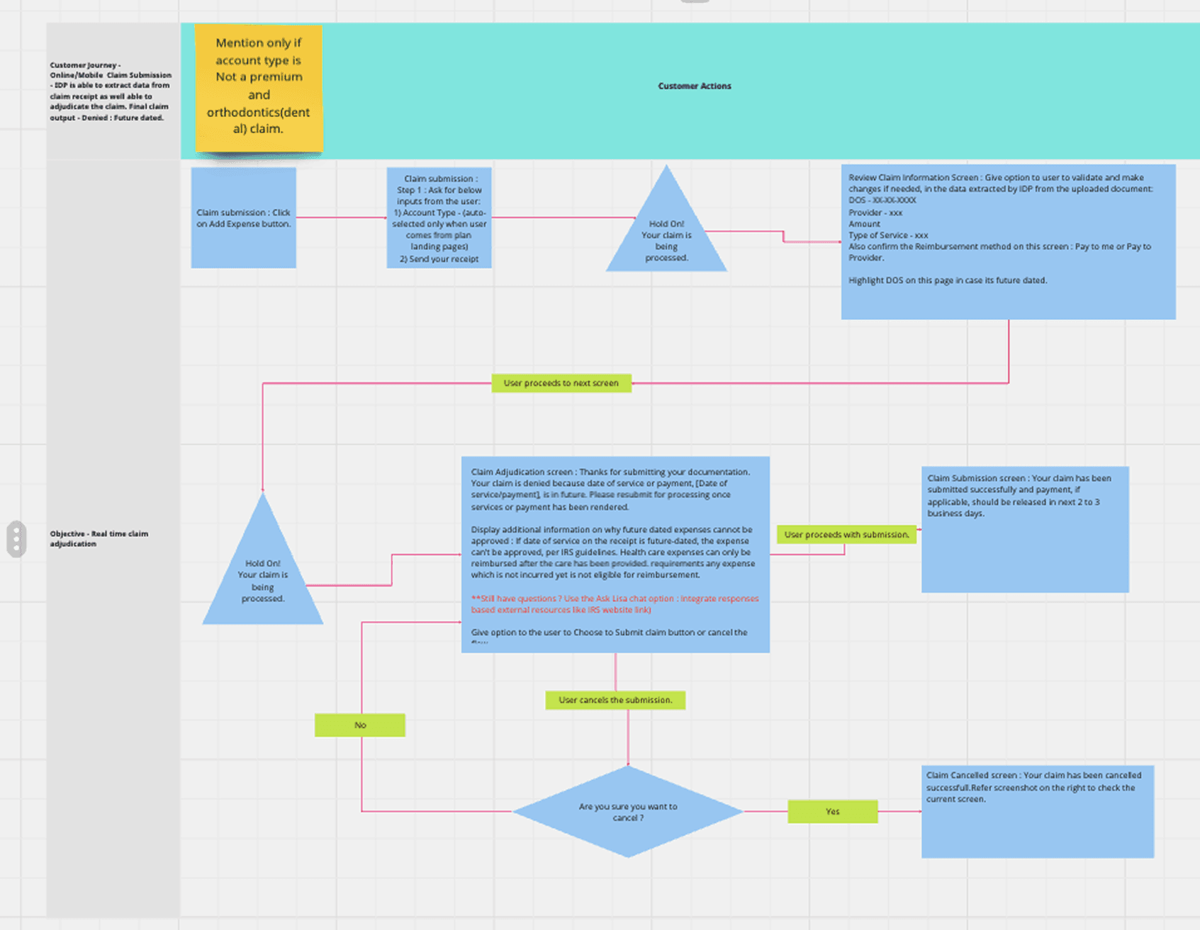
I began by mapping 13 required flows—approved, insufficient information, declined, manual review, SOMN, and partial approvals. Starting with the mobile “happy path” (approved claim) allowed us to scale patterns efficiently across all variations.
Early testing revealed major clarity issues:
Nearly half of participants misunderstood eligibility outcomes.
Many confused claim eligibility with reimbursement eligibility.
Users wanted clearer explanations for declined or manual‑review claims.
To address this, I facilitated a cross‑functional workshop with PMs and engineering, using HMW statements and structured ideation to align on next steps. The content team became a core partner as we refined language across all flows. A second research round validated improved copy and exposed remaining gaps—especially around manual review and partial approvals—leading to further iteration.
Outcome & Impact
By Q1 2025, we transformed a slow, manual process into an automated pipeline. The system processed hundreds of thousands of claims, achieved meaningful straight‑through processing, and delivered decisions in hours instead of days. Reimbursement timelines shortened, call volume dropped, manual adjudication load decreased, and users received clearer, faster, more actionable feedback.
SCROLL DOWN FOR A FULL DEEP-DIVE ↓
Overview
Alight’s claim submission experience relied on a lengthy, manual, five-step process that created delays, confusion, and high customer service call volumes. Every claim required human review, leading to slow turnaround times and inconsistent experiences.
With the introduction of an AI‑powered Intelligent Document Processing (IDP) system, we redesigned the submission flow so users could upload receipts and receive near‑real‑time eligibility feedback powered by AI/ML and Generative AI.
Project Goals:
Streamline the submission process
Integrate AI automation into a clear, intuitive UX
Support 13+ outcome scenarios
Improve clarity around eligibility and next steps
Reduce manual review and call center volume
Role: Lead Product Designer (leading meeting and communications between various teams, designing mock-ups, and prototypes)
Team: Product Designer, Content Strategy, Research, Product Manager, Engineering
Platforms: Mobile‑Responsive Web + Desktop
Context
The Old Legacy Experience
5‑step, manual, slow process
Users waited days for decisions
Confusing terminology around eligibility
High dependency on claim processors
High customer service call volume
Limited transparency into why claims were approved, declined, or partially approved
Product Managers also shared example flows as subject‑matter experts, giving a clear starting point for early design exploration.
Explorations
Low‑ to high‑fidelity mock-ups were created for all 13 flows, including approved, declined, insufficient information, SOMN, partial approvals, manual review, and upload errors. Each flow required clear explanations, consistent structure, and actionable next steps.
Mobile‑First
Starting with the smallest screen made it easier to focus on what truly mattered. It pushed stripping away anything non‑essential and building a clear, scalable foundation.
Start with the Happy Path
We built the approved claim flow first to establish structure and patterns, and then scaled it across the remaining flows. for all 13 flows, including approved, declined, insufficient information, SOMN(Statement of Medical Necessity), partial approvals, manual review, and upload errors. Each flow required clear explanations, consistent structure, and actionable
Leverage Existing Patterns
Used the existing claim flows, mobile app designs, and design system components to maintain consistency across other Alight products.
Content Collaboration
Copy was a vital part of the user understanding the claim submission process. Content strategists were brought in early to shape clear, empathetic messaging
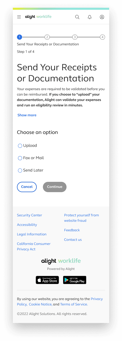
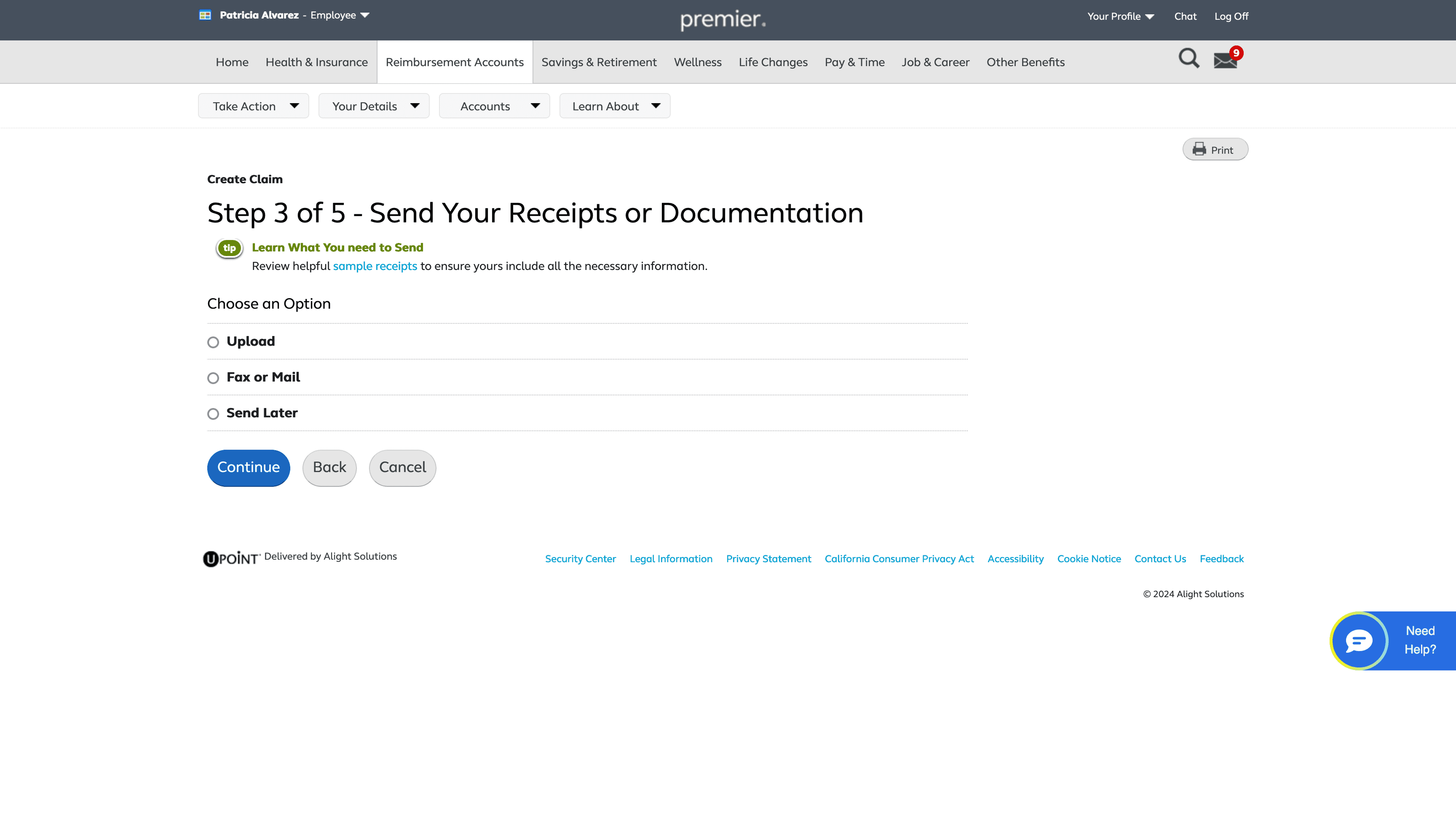
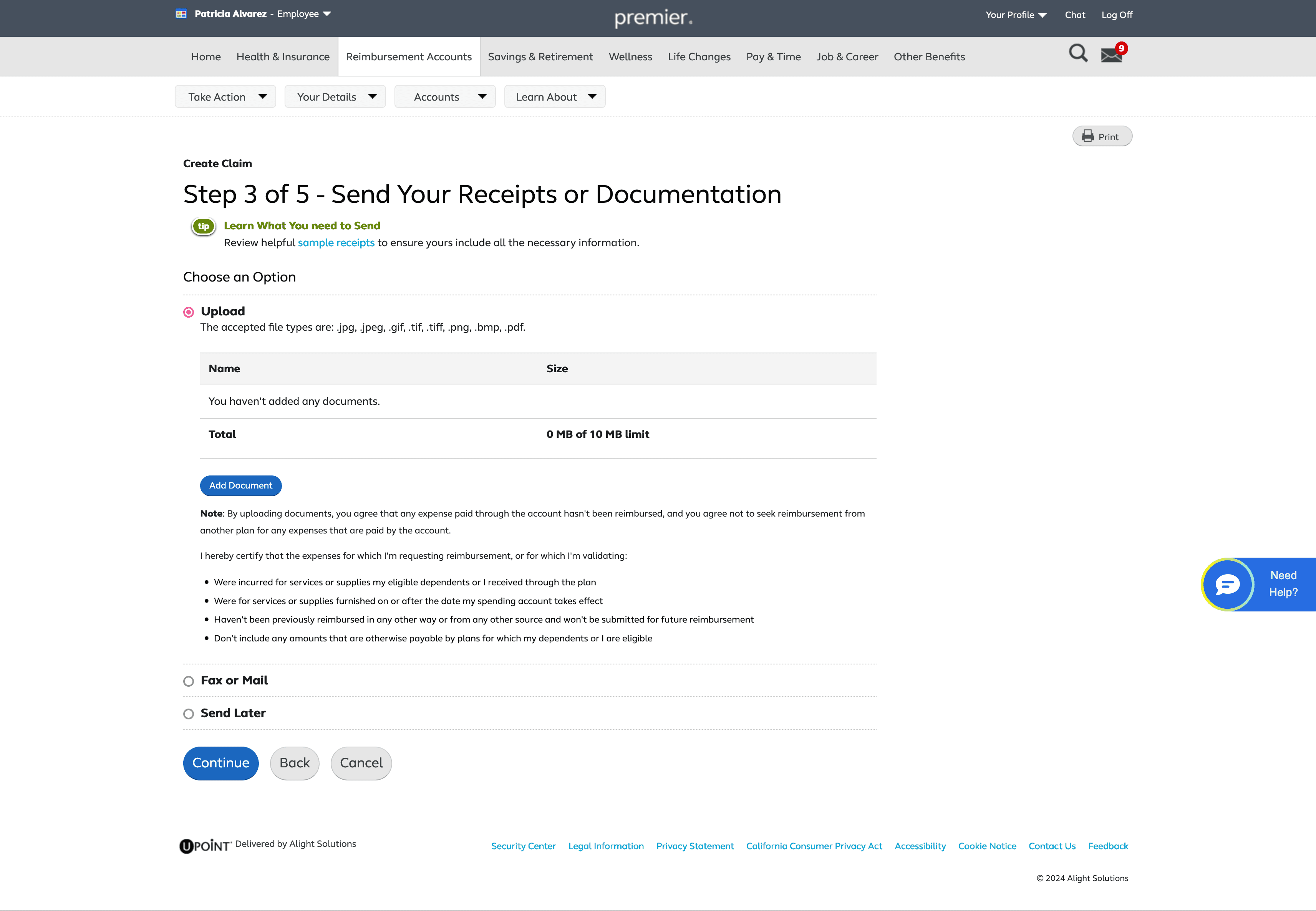
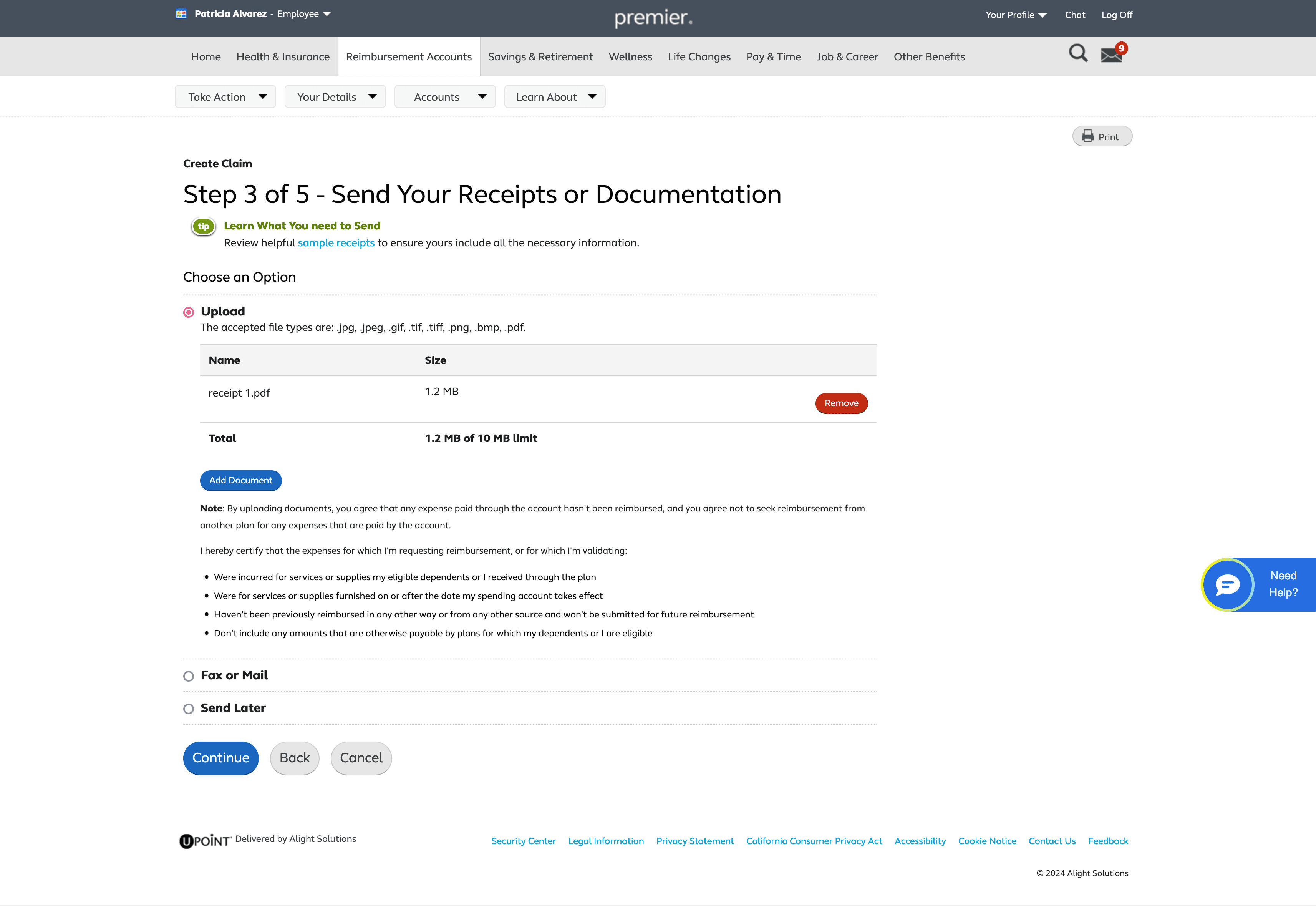
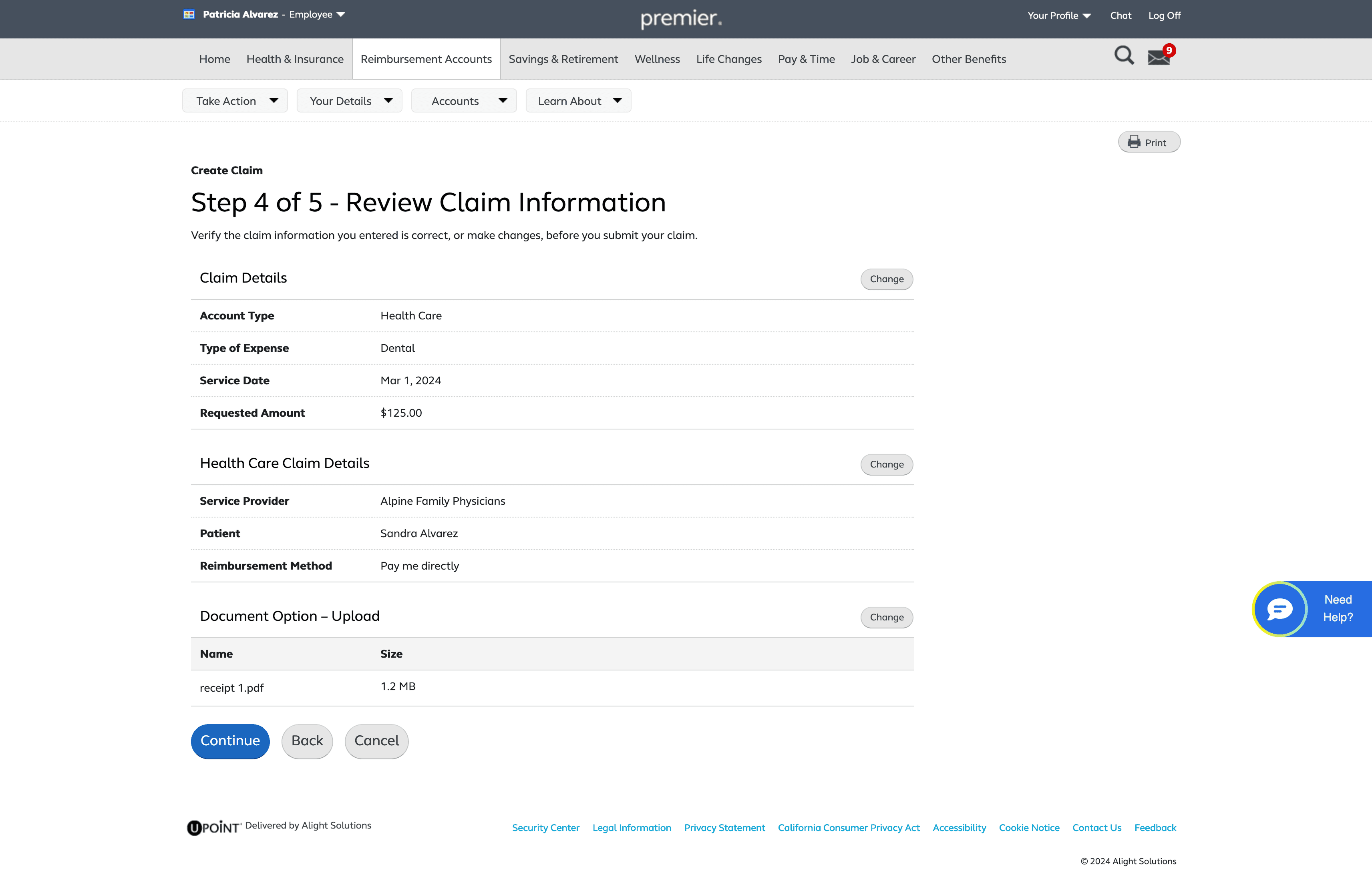
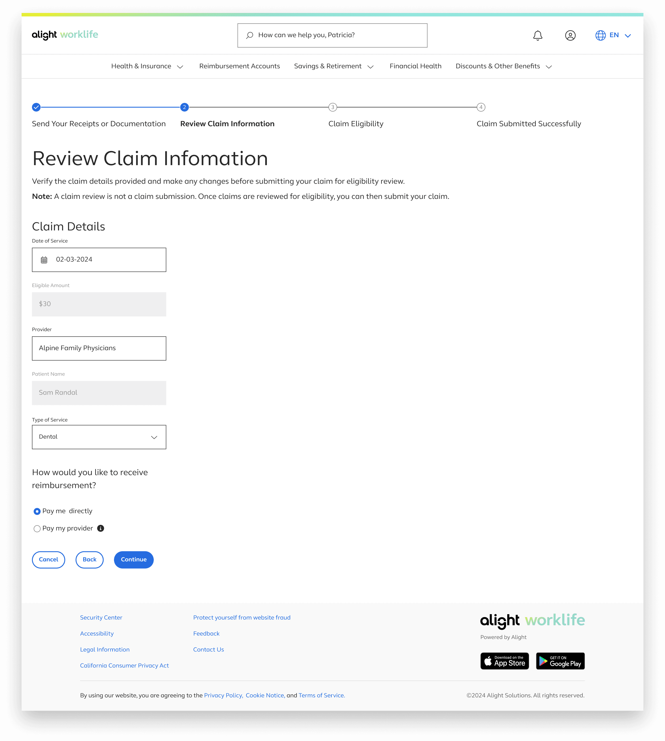
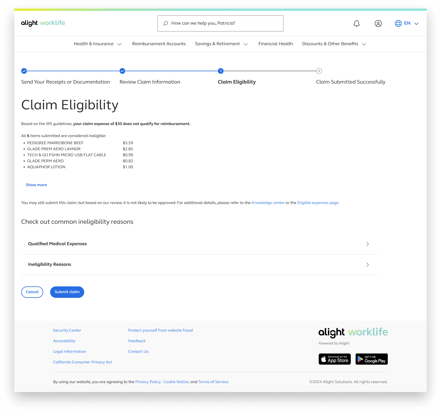
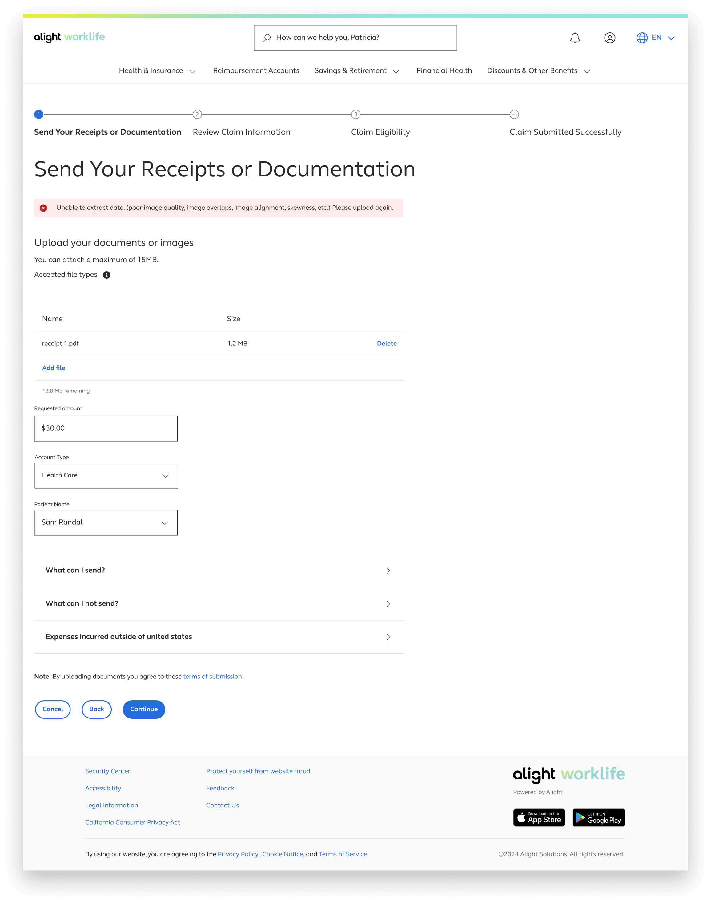
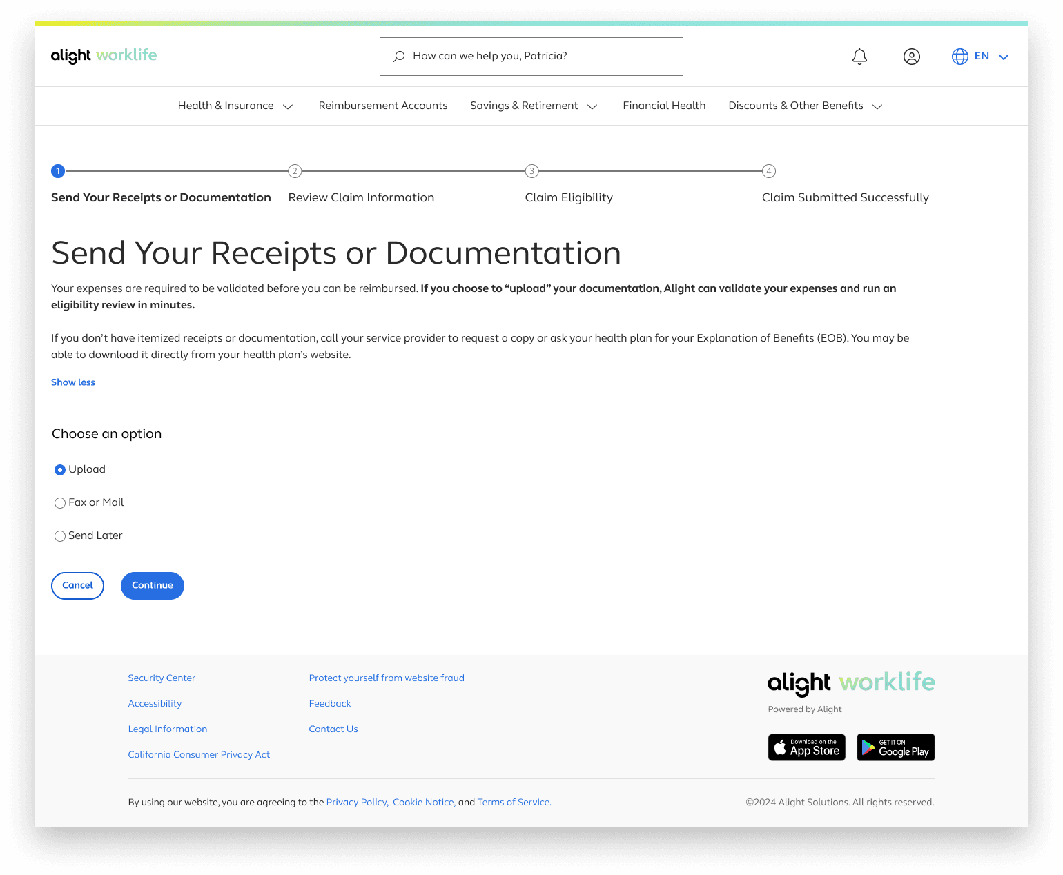
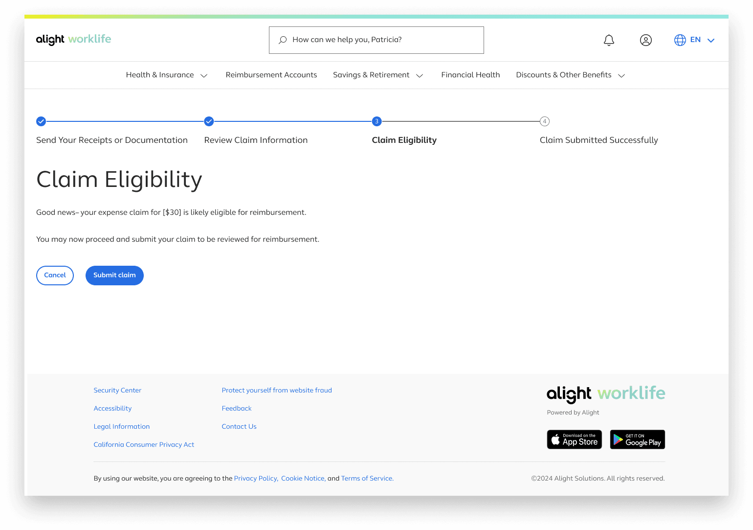
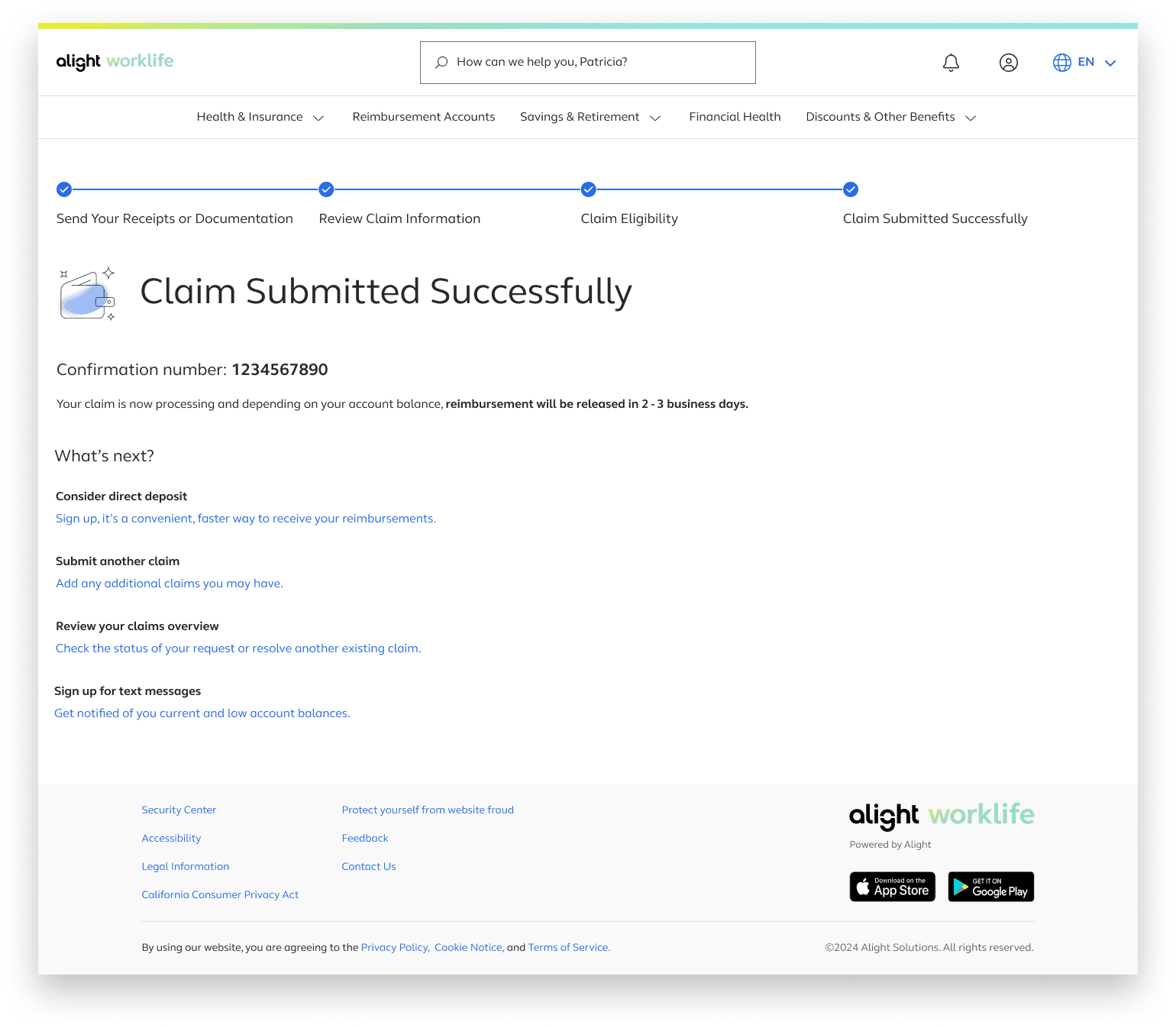
The general design consisted of four steps Send Your Receipts or Documentation, Review Claim Information, Claim Eligibility, Claim Submitted Successfully
The Flow
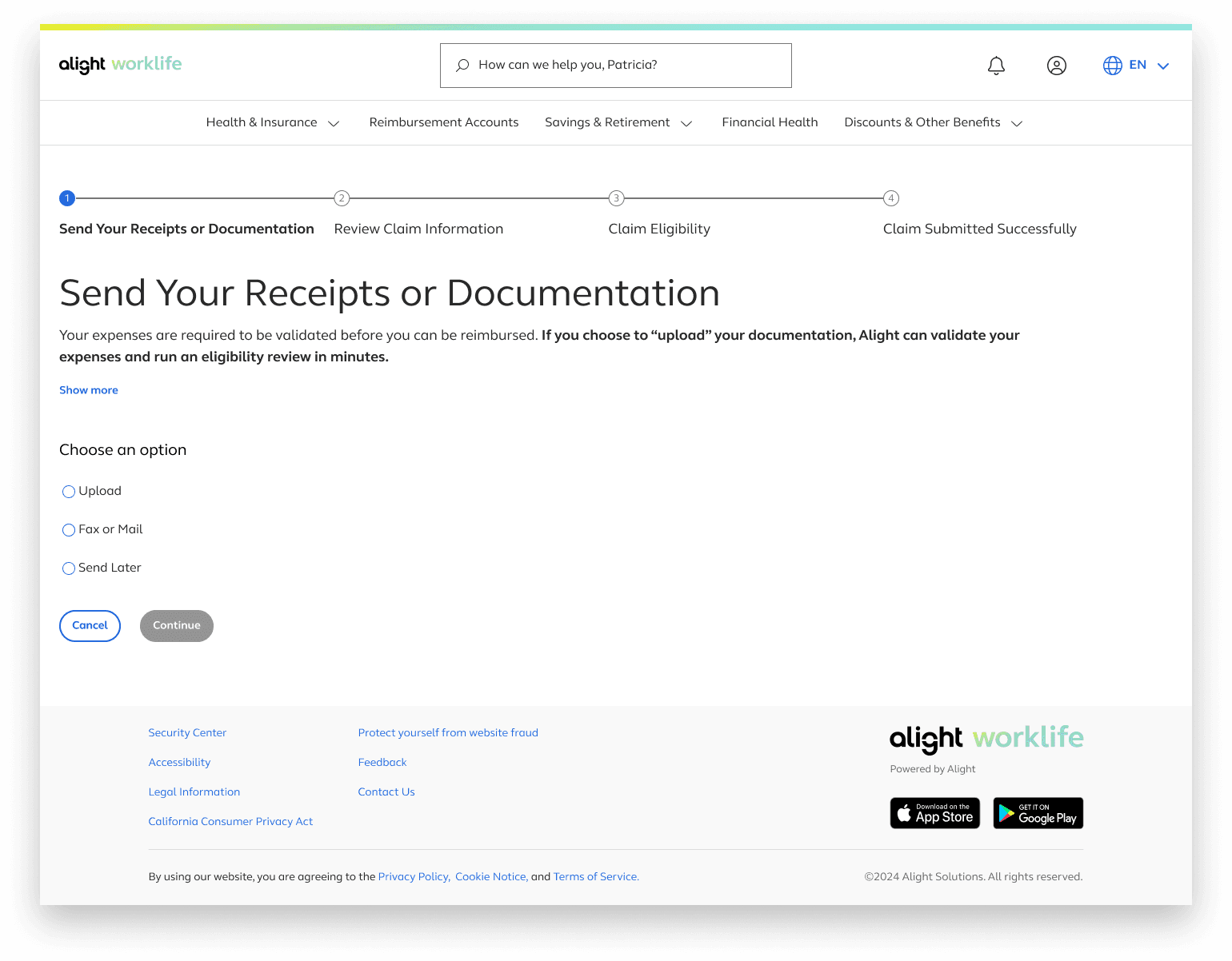
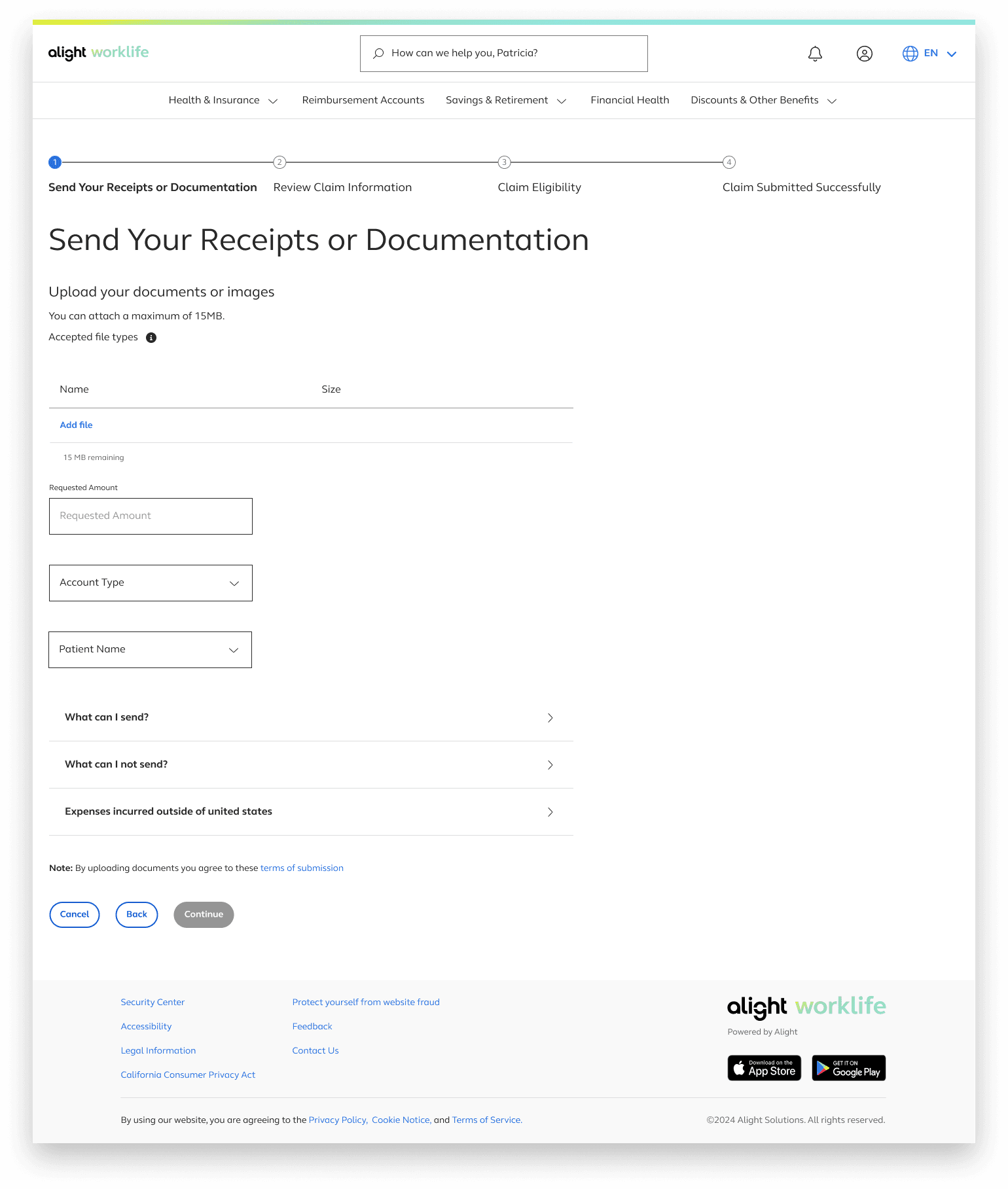
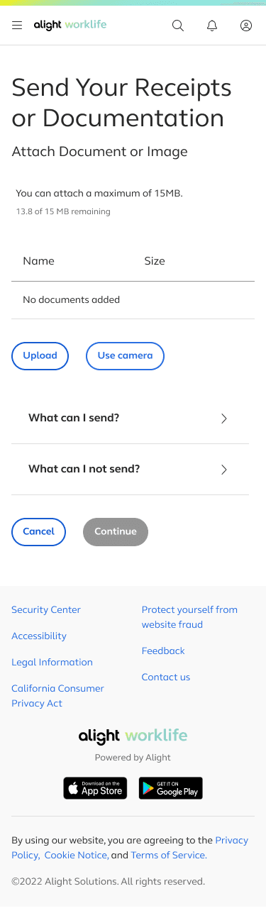
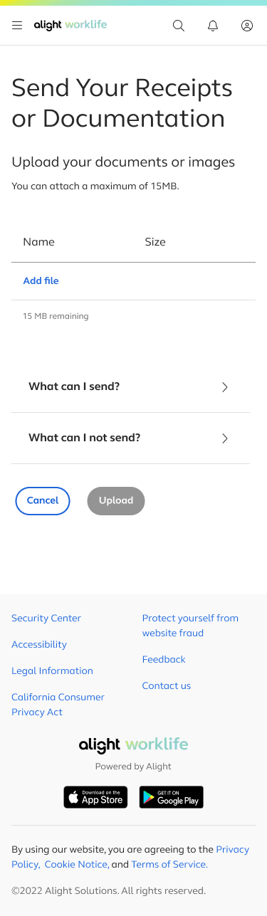
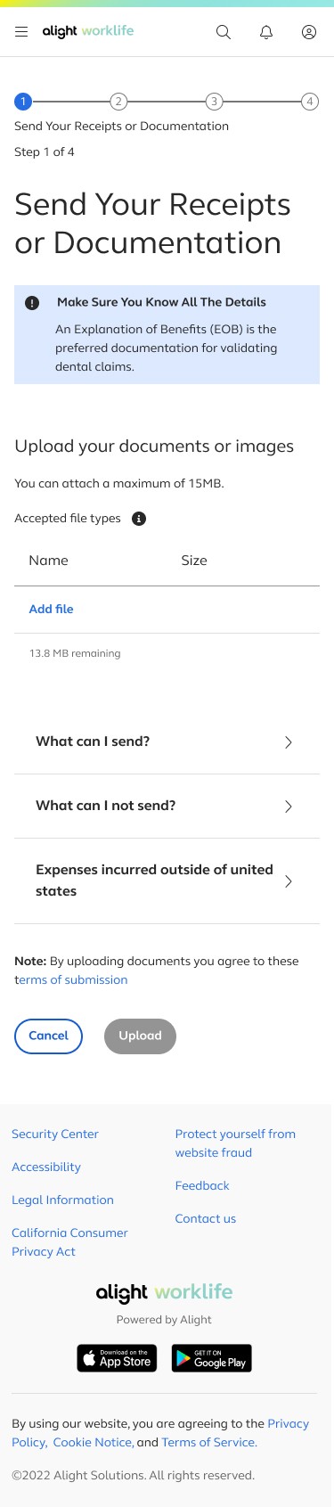
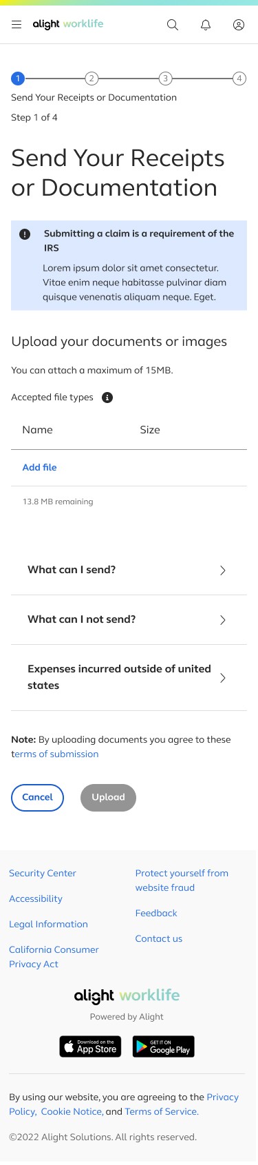
Send Your Receipts or Documentation
The first step revolves around choosing how a user would like to submit a medical receipt or documentation
Date of service, provider, and type of service are then extracted from the uploaded receipt/documentation
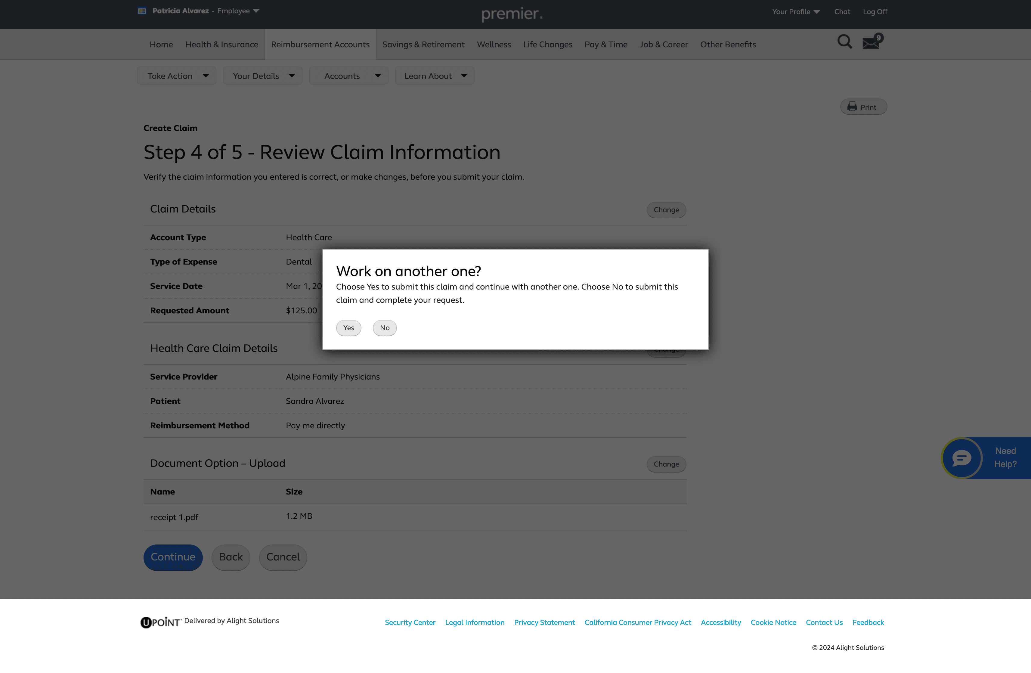
Review Claim Information
The interface then takes the infomation on the previous page and decides claim eligiblity
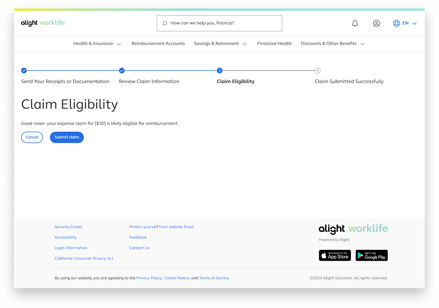
Claim Eligibility
The interface then takes the infomation on the previous page and decides claim eligiblity
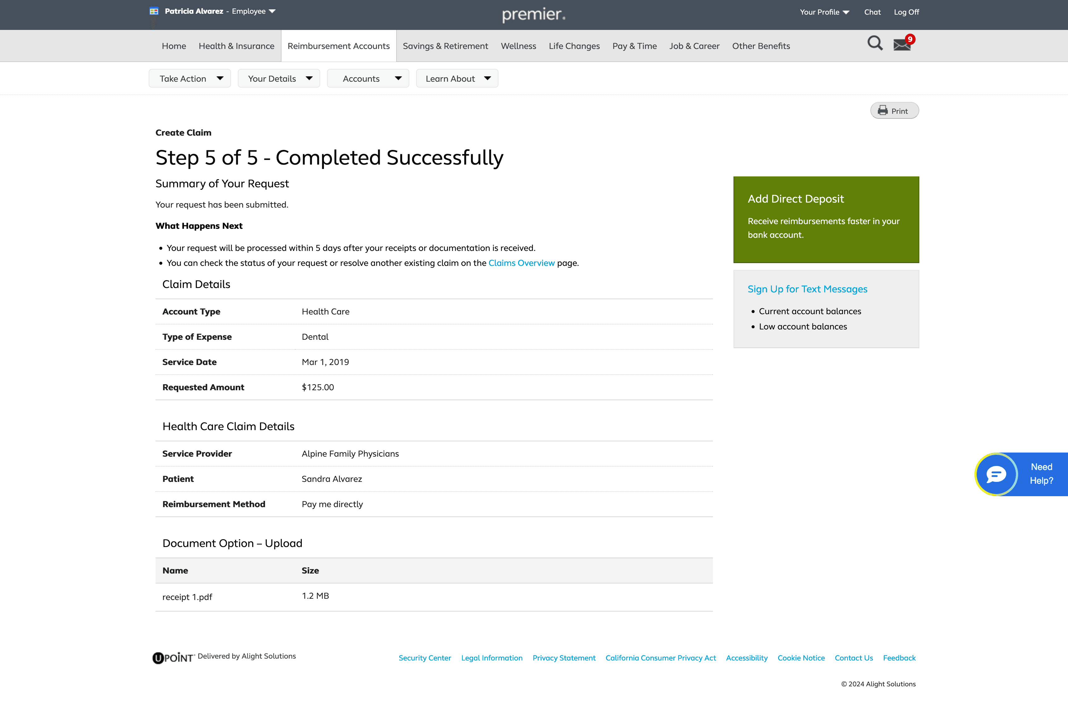
After submitting the claim users will be directed to a confirmation page with next step
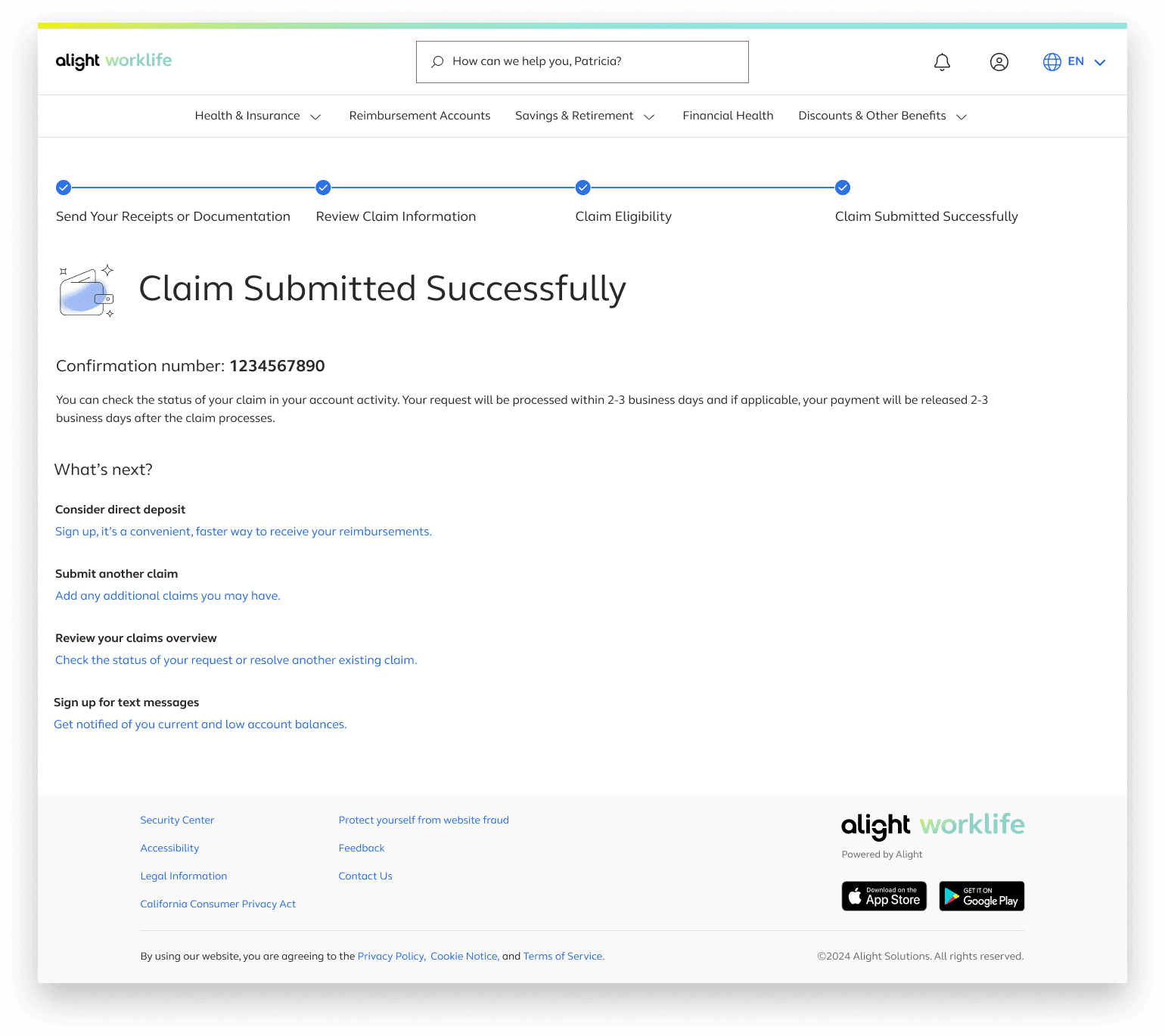
Claim Submitted Successfully
User Testing
We conducted multiple rounds of moderated testing to validate comprehension and identify friction points.
Round 1: Approved + Declined Flows
We tested foundational flows first. These revealed confusion around:
Claim eligibility vs. reimbursement eligibility
Why claims were approved or declined
What users needed to do next
Doesn't explictly state that claim eligibility and reimbursement eligibility aren't the same thing
Eligible claim
Ineligible claim
Manual Claim information input/eligibility
Users wanted clearer explanations for manual review
Partial approvals needed clearer breakdowns
Statement of Medical Necessity (SOMN) flow was clear and understood
Upload errors required more actionable guidance
Round 2: SOMN,Manual Review, Partial Approvals
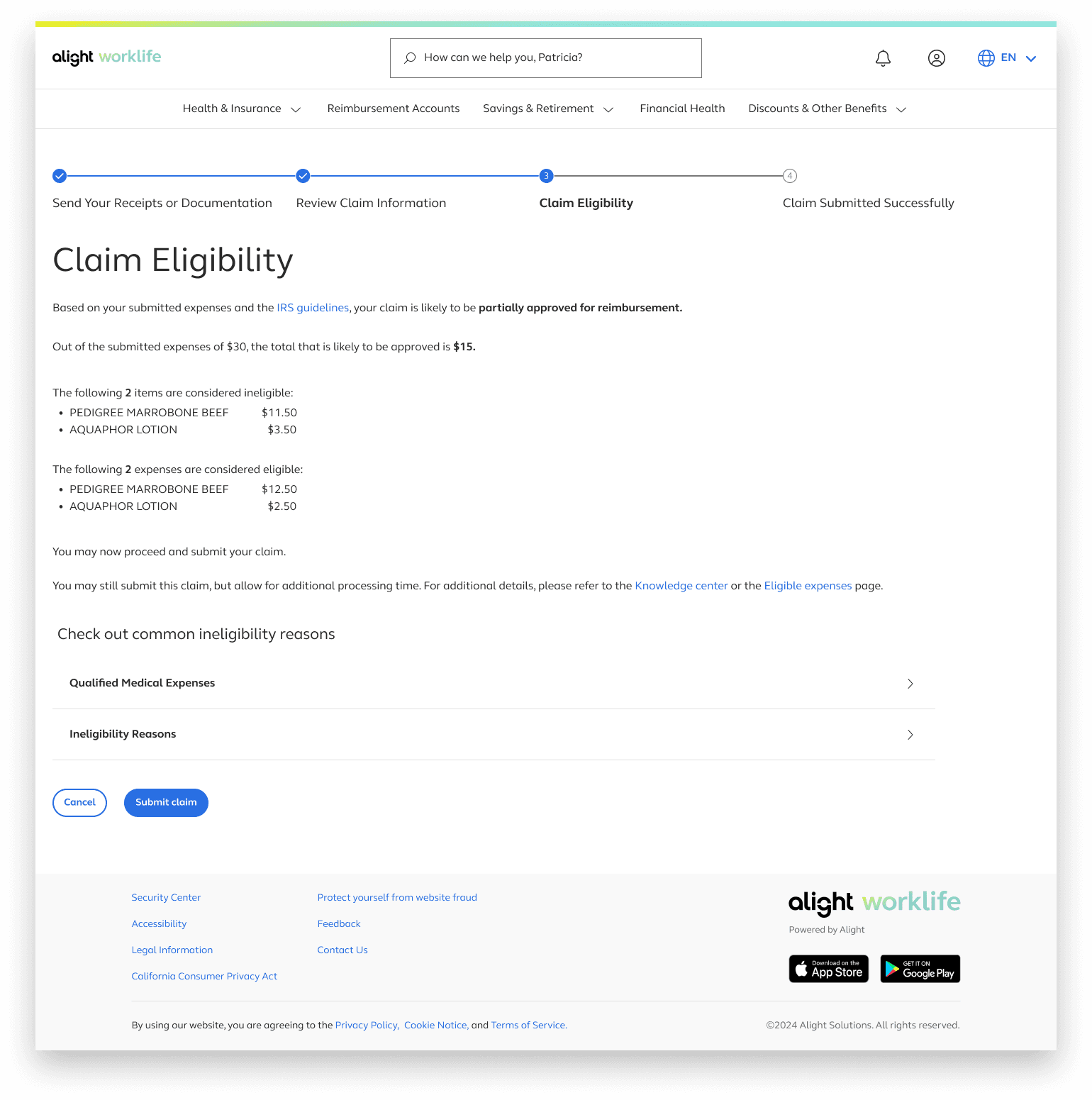
Partial claim eligibility
With alignment in place, we moved forwarded with finalizing the designs.
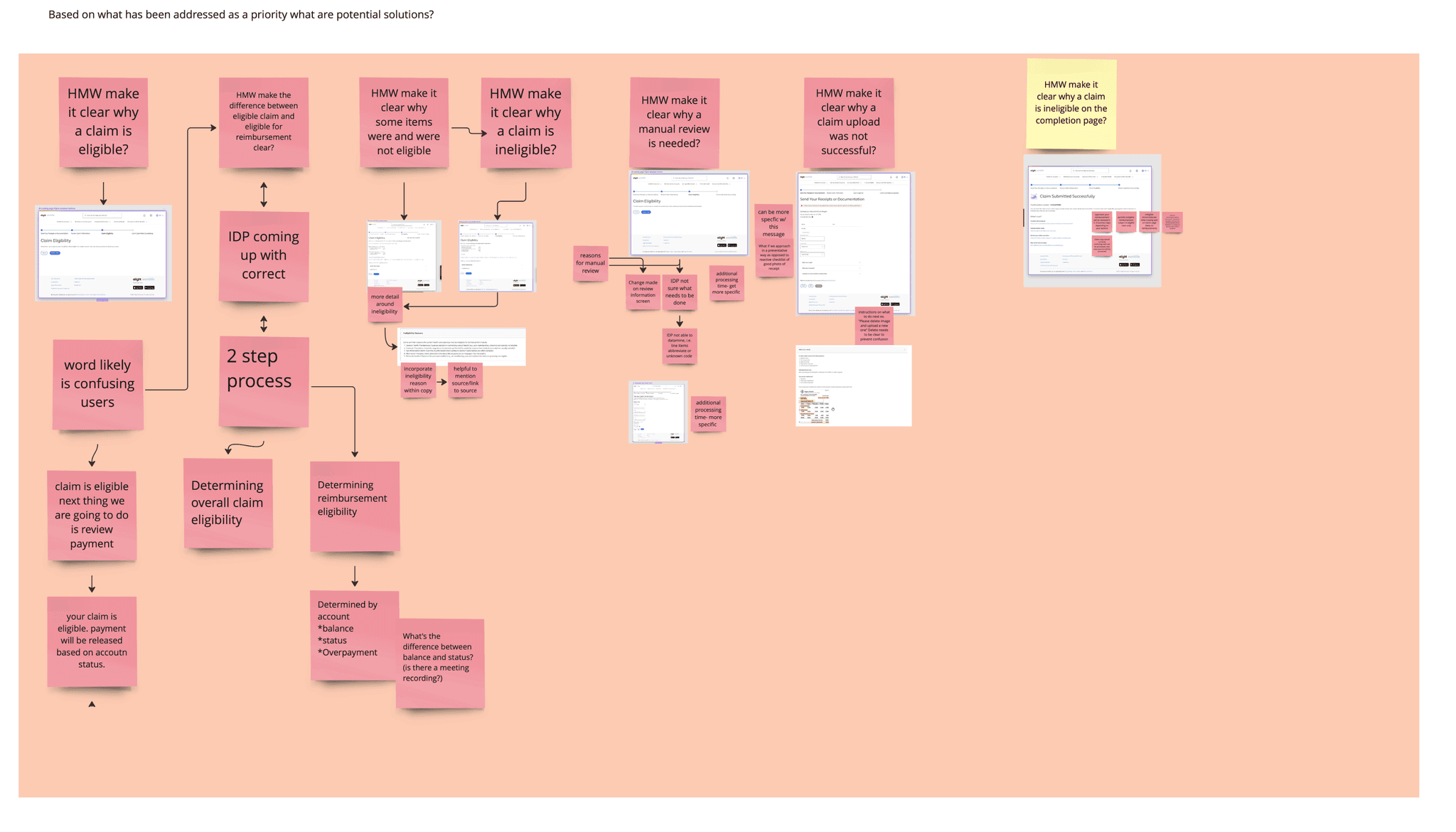
Cross-Functional Workshop
Creating HMW Statements.
I laid out the research findings on Miro in a clear slide‑style format
From the research, I added How Might We statements to frame potential concerns.
I color-coded them by priority: Must-Have and Nice-to-Have. This made it easy to see which issues required immediate attention.
Team Review + Additional Input
I then met with PMs, engineering, and content to review the board. We discussed the HMWs, added missing ones, and aligned on what else needed to be addressed.
Prioritizing What to Solve First
Together, we selected the HMW statements that would guide the next iteration based on user impact, feasibility, and cross‑flow dependencies.
Quick Ideation + Next Steps
We closed the session with quick ideation on the top‑priority HMWs, exploring ways to improve clarity, structure, and content patterns.
Why is my claim eligible?
Why is my claim ineligible?
Why are some items eligible and others not?
What’s the difference between claim eligibility and reimbursement eligibility?
Why did my upload fail?
Why is my claim ineligible on the completion page?
Why does my claim require manual review?
These became the foundation for clearer, more transparent messaging across all flows.
The final experience delivers a clear, consistent, and intuitive flow across all 13 scenarios. Users receive immediate feedback, understand next steps, and experience a more transparent process.
Final Designs
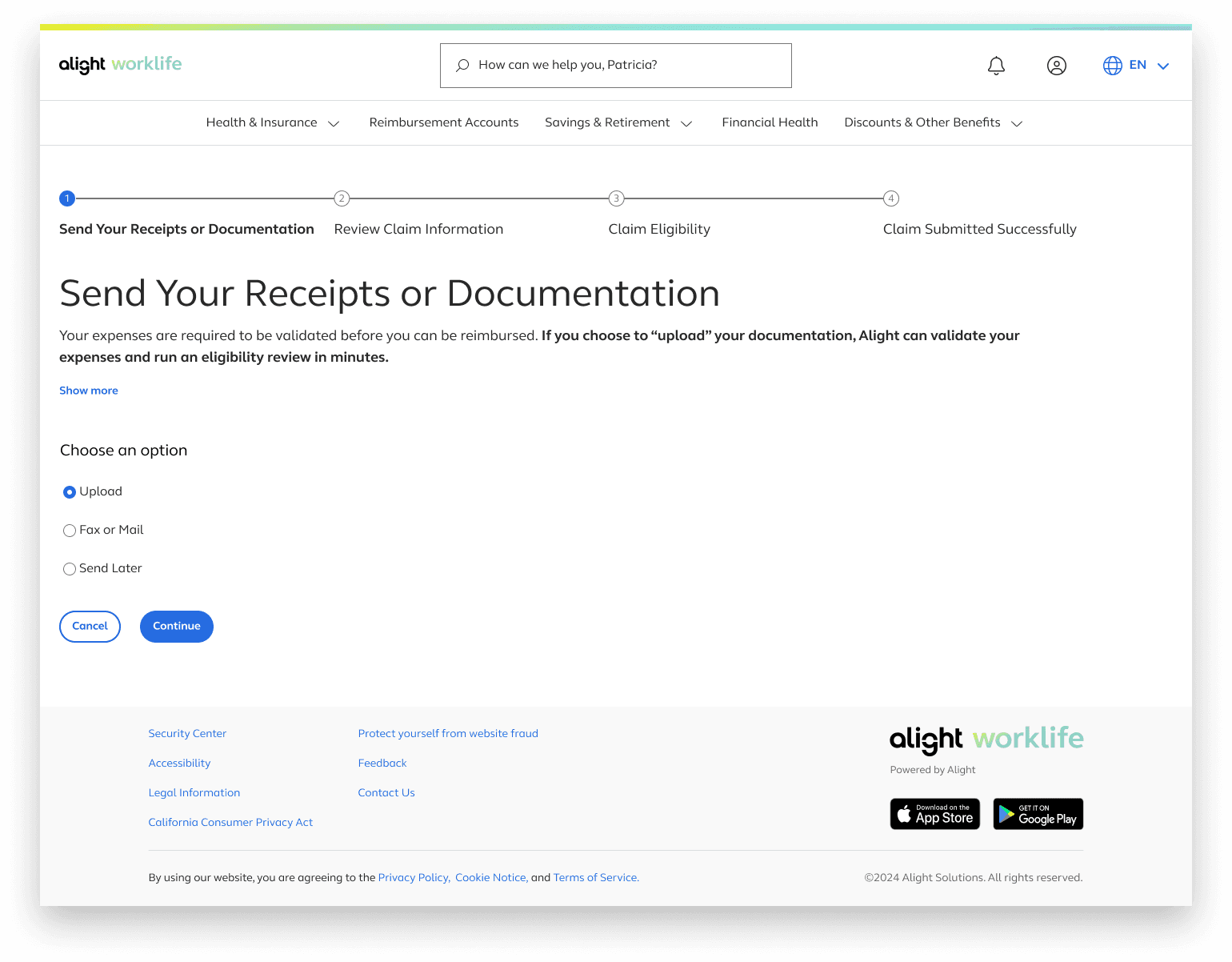
The additional text under the “Show More” button also provides early guidance on the documents required for the file upload option.
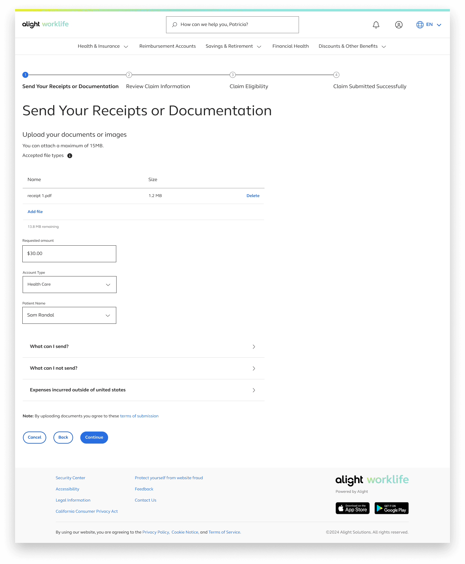
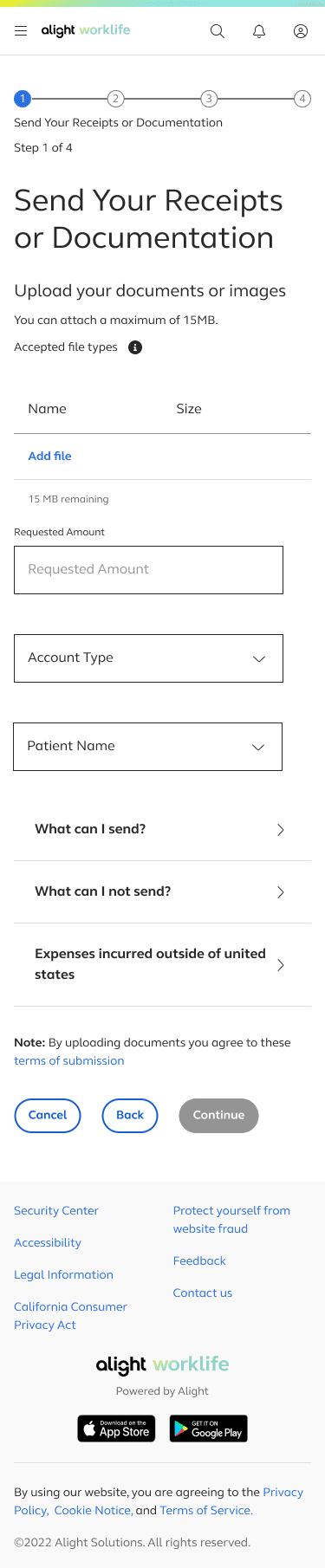
If users need to upload multiple files for a single claim, we provide visual feedback for each upload, including file name, file size, and a running counter showing the remaining allowable upload size
Users also enter their requested amount, account type, and patient name, since these details aren’t extracted from uploaded documents.
With this process being very infomation heavy detailed infomation was trunciated into accordian menus in order to not overload the page but still provide this inofomation if a user needs it.
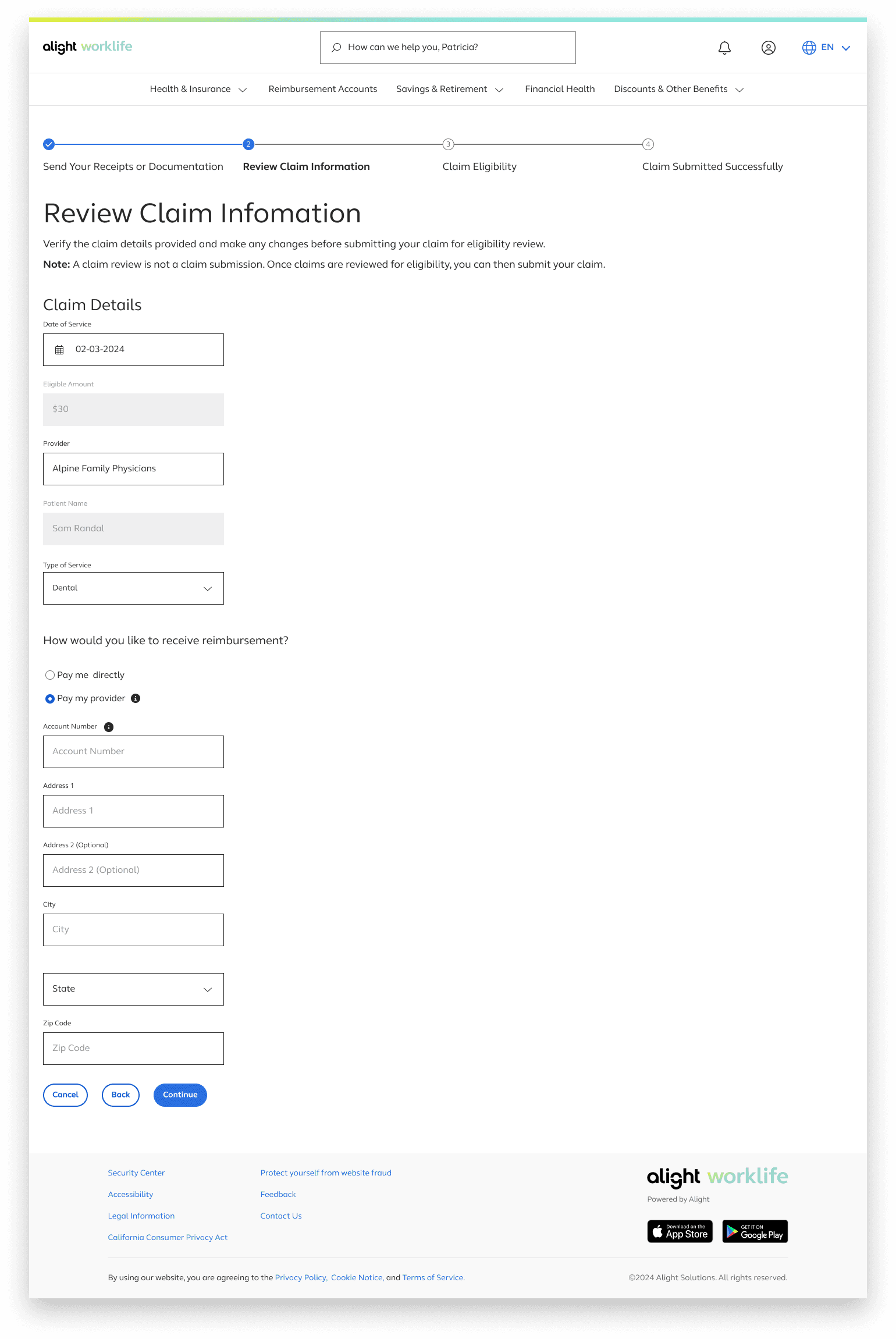
A “Note” was added to clearly communicate the purpose of this page and prevent users from thinking they are submitting their claim at this stage. The progressive button language—using “Continue” instead of “Submit” on the claim‑eligibility page—reinforces this distinction.
Reimbursement information is included here because it relates to how users receive payment, not to the act of uploading a claim. Placing it on this page keeps the flow focused and avoids mixing it with upload‑specific tasks.
Try out the flow!
By Q1 2025, the redesigned experience delivered measurable improvements
Hundreds of thousands of claims processed through the new pipeline
Significant increase in straight‑through processing
Decisions delivered in hours instead of days
Shorter reimbursement timelines
Reduced customer service call volume
Lower manual adjudication load
Clearer, more transparent user experience
This project reinforced the importance of designing for clarity when introducing AI into complex workflows, bringing content strategy in early, testing often, and creating scalable patterns for multi‑scenario systems. It also highlighted the value of structured cross‑functional alignment and collaboration to reduce miscommunication, re-work, and accelerate decision‑making.